ORO DESIGN CONFERENCE 2019
PROJECT DETAILS
CD & AD: Uncurated Studio
Video: Misfit Productions / Nikko Tan / Ryan Avellana / Malo Canon
Soundscape: Rotsanjani Mojica
Photos: Rob W. & Three&Three Creatives
• • •
ABOUT
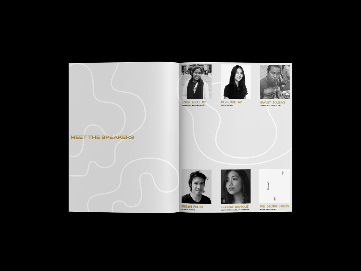
Oro Design Conference gathers six prominent designers and design studios from different parts of the Philippines, to share their stories, process, and advice to inspire curious and creative minds within the area. It’s the first of its kind in Northern Mindanao and is held at Capitol University’s Mini Theatre on February 9, 2019. The conference is geared towards graphic design and its interdisciplinary effect on different creative fields.
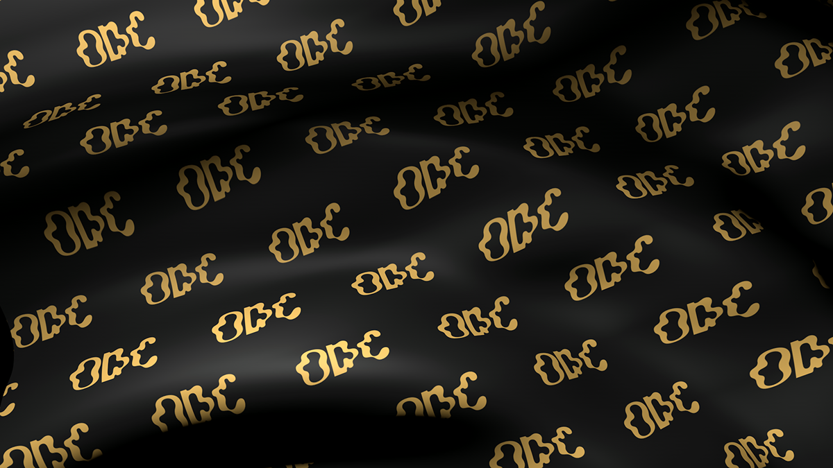
Being the first instalment and a first in the Northern Mindanao region, the theme revolves around the literal translation of the word “Oro” which means gold. For its identity, we decided to make it type-centric and weave every graphic element to visually translating it typographically.
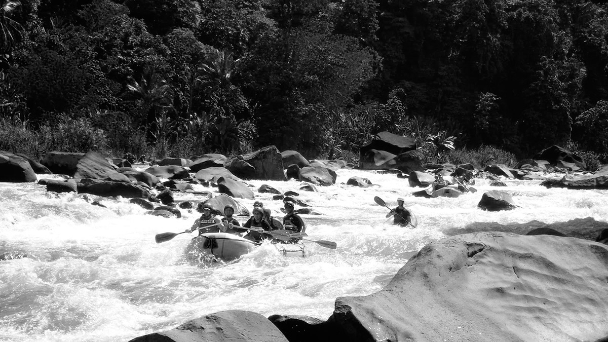
Aside from the warm hospitality, Cagayan de Oro City is also known for its river and is often associated with countless myths, legends and folk stories. With this, we decided to use a typeface that would translate the wavy, flowy and eccentric characteristic of the river and used Radimpesko’s Lyno Jean typeface. We also used Good Type’s Adieu to compliment the primary typeface.


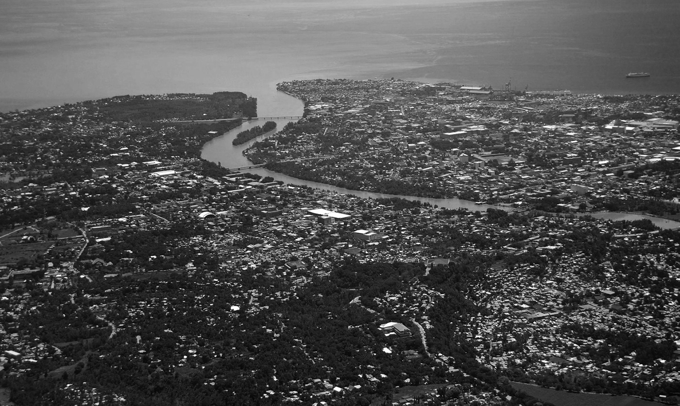
Since we already established that the geographical landscape of Cagayan de Oro is where one of the main points that the identity base on, we further drew inspiration from topographic maps and drew wavy lines overlaying poster texts. The lines are based from the ODC logotype.
The poster comes in two alternate colors, one in black and the other in matte gold. It also serves as an event brochure when flipped.
While deciding on the tickets and other materials that needs paper, it was a no-brainer that tickets need to be in gold finishing. Luckily for us, there is a local paper supplier which caught us in surprise since CDO is relatively far from the metro in the Philippines. They had metallic gold papers and even helped us in printing.
We also made use of an embosser to even more give that tactile feel.


There was a need to create digital booklets since most of the people in CDO are not familiar with the idea and format of creative conferences. We needed to create a simple booklet that would inform them about the event, speakers, and programme that will take place.
We also created simple templates for instagram and facebook postings.

We wanted the event to be cohesive in terms of experience. Originally, we only decided to come up with an official opening titles score. However, Rotsanjani Mojica, who is a local producer who is known for his experimental music production that reached the stages of Germany and Taiwan, he suggested to have an official soundscape that would play all throughout the event.
There is also an intent in creating a sound signature that will also be present in the future instalments of the design conference.
Part of the core team of ODC'19 is Nikko Tan, an art director of Misfit Productions. He mainly worked with the creative direction together with his team to create the elements. As far as the direction goes, the brief was to further visually translate the theme of gold through the moving titles.